What Does Responsive Web Design Mean in WordPress?
When we talk about ‘responsive design’, it simply means designing a website to adapt to the screen size being used. WordPress does not do this ‘automatically’ – it depends on the theme being used and how well the pages have been designed.
If you’ve ever come across a WordPress site that was hard to read or hard to use on your phone, then you’ll know what I mean.
Typically the problem shows up as a the whole webpage squeezed onto your screen with tiny unreadable text, like this:-
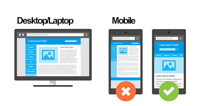
Then only way you can use the site is by pinch zooming in, and scrolling left and right to see everything. It’s hard work, which is why this can greatly hurt your website. Because people will leave quickly to find an easier to use site, and that sends a strong signal to search engines like Google to say ‘this site is not good’.
Google are fanatical about user experience – so if your site provides a bad experience for searchers then they will send less of them to you!
Things have also changed so much now, that Google actually prioritises the mobile version of your site. That’s the version they now add to their vast index of websites. Mobile website users have not been an insignificant minority for years now. For most websites mobile users will tend to be at least 20%. And this can easily be 50-70% depending on the industry and demographics of your customers.
The good news is that this can all be fixed.
How Do I Make My WordPress Site Responsive?
You have a choice on how to approach making your WordPress site more mobile friendly. Ideally you hand this over to a good WordPress web design agency who properly understand how users interact with websites.
It may be enough to just update your WordPress theme. But a lot of WordPress themes just get abondoned by their developers, so there may not be any update. Even if you paid for a premium theme this may still be the case.
You can try changing your WordPress theme to a new one – something that states it is responsive or optimised for mobile. The results can be a bit unpredictable however depending on how simple your site is, and what theme you are currently using. It might take a couple of hours of tweaking to get things looking right again, or it might requier days to get everything working properly again.
But there’s more to good responsive design than just making things fit on the screen. If you’re using WordPress for a small business site, then you still want your website visitors to take certain actions when they use your site (call you, book an appointment, buy something etc). So those things still need to have the proper flow and prominence when your WordPress site layout changes due to smaller screen sizes.
Properly optimising your WordPress site for mobile will mean sales come from both desktop and mobile customers.
More Information